
Creating B2B branding with meaning, makes it memorable.
- Alistair Ross

- Jul 14, 2020
- 6 min read
Updated: Sep 18, 2023

Branding is a series of sensory codes, designed to create mental shortcuts between an organisation and both existing and potential audiences. Successful branding should be designed to attract our sight (colours, fonts, patterns, motion graphics, characters), our hearing (music, sonic mnemonics), even our smell, taste and touch, if that's relevant to the particular brand. The aim is to create mental familiarity, which drives consideration.
Branding acts as a trigger whether conscious or subconscious, so by its very nature branding needs to be distinctive, memorable, and differentiated when placed alongside category competitors. Most important it needs to be attributable back to the company it represents.
It's easier to remember brand properties that are imbued with meaning. O2's bubbles, Amazon's A-Z smile, and Nike's swoosh were three that immediately sprang to mind, indicating strong unprompted recall.

At launch, O2 wanted to be seen as a breath of fresh air, rising up against the rigidity of the other networks. The bubbles amplify this idea, and combined with the 'blue grad brand world' help create distinction, memorability and consistency across B2C and B2B.
Amazon's smile branding adorns multiple touch points and turns the rational A-Z product promise into an emotional customer facing one, a graphic symbol of the brand promise.
The Nike 'swoosh' conveys dynamism without audiences needing to know that Nike was the Greek goddess of victory. Knowing the latter though imbues the swoosh with meaning that elevates it into purposeful branding. Three examples where the branding builds on the brand name and adds meaning to underpin the positioning.
Too much branding, particularly in the B2B technology sector, doesn't feel customer-centric, feels superficial, and lacks any real meaning for an audience to remember. Branding in any sector should look to reinforce a positioning in customer's minds.
Perhaps this superficial design-led branding is indicative of a deeper underlying lack of clarity in how the brand is positioning itself to customers? 'We don't know exactly what our positioning is, so here's some graphic triangles mixed with generic business imagery while we work it out'
The most successful brands are customer-centric in their marketing, not product-centric. This needs to be reflected in the meaning that any branding is trying to reinforce or convey. Superficial graphic design paired with generic business stock photography, devoid of any clear organising idea in its creation, leads to two-dimensional, corporate camouflage. The opposite of what branding should be doing. This approach delivers lower brand awareness, slower growth and significant multiplications in any media spend. Be distinctive, be differentiated with meaning, and you'll be remembered.

Even world-class graphic design, such as Noma Bar's amazing illustrations for IBM's 'Outcomes' campaign, does more to promote the illustrator than the IBM brand. Bar's visual style becomes the branding, and IBM can't own this style exclusively as he's commissioned by other brands and imitated by other illustrators too.
With consistent use and heavy media spend, IBM's deep pockets slowly make this visual style synonymous with their brand. But it's not as effective at building brand awareness, as for example, O2's bespoke blue world and bubbles - a winner of countless IPA effectiveness awards since its launch, and rightly so.
We are living through a decade of brand homogeneity, where the speed and functionality of digital platforms has driven an 'airspace' flat colour, san-serif branding aesthetic. Everything is visually converging.
Wearing similar clothes to your competitors can become an expensive exercise, even if your desire is to mimic a sense of being more established than you perhaps are. There is opportunity here though for smarter brands, particularly younger ones, to maintain their distinctiveness and stand out from the crowd of grown-up lookalikes.

Branding is one of the most fundamental weapons in the marketing arsenal and should reside ultimately under the control of the CMO. Don't get led a merry dance by brand teams with an infatuation for subtle aesthetics. Demand that you have a brand that can quickly generate unprompted awareness, or set about evolving yours until it can. I say evolve because I believe that's how the smartest brands operate. Refresh don't replace. I spent the first two decades of my career in advertising agencies. There it was common practice to look to create brand properties that drove audience engagement. Brand characters, brand songs, and brand worlds were three such approaches. Valuable branding properties that unmistakably brought to life the meaning in the brand stories.

These brand devices can work just as well for B2B brands as B2C ones, as Salesforce, ReadMe and Firefox show below with their brand worlds and brand characters respectively. Or HP with their brand antagonist, The Wolf. All brand properties with actual meaning. I've met opposition when suggesting using successful B2C branding devices in B2B marketing. The argument is usually that they can't deliver serious messages. Tell that to Hector the Tax Inspector. Not popular internally at the Inland Revenue I'll concede, but remembered by customers universally, and effective at landing serious messaging.

'When B2B brands create branding properties with meaning, be they worlds, characters or devices, they turbocharge all their demand generation campaigns. These B2B brands are then able to do brand awareness simultaneously not separately. That's smart marketing.'
Brand awareness takes time to grow, so don't silo 'brand' into a separate campaign that you'll struggle to get budget for, or justify short term ROI. Incorporate branding with meaning into every demand generation campaign and you'll grow brand awareness too, creating a virtuous marketing circle.
Naturally we practice what we preach at LogicLogicMagic®, so here's a couple of examples of B2B branding with meaning which we have created recently.
Demand Generation branding device: Okta. Circles of Trust.
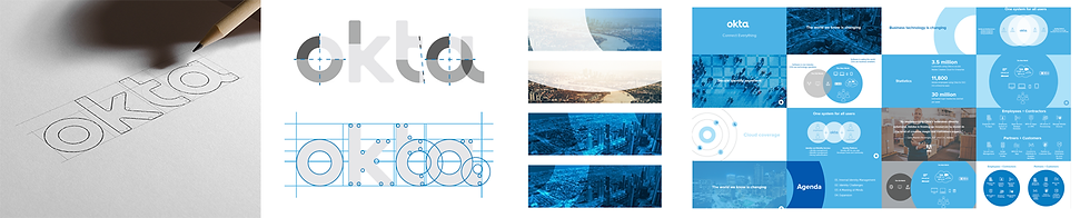
Okta use identity to enable simple, secure cloud access from any device, anywhere for workforces and customers. Previous marketing was very technical and product focused, utilising a consistent visual brand language of graphic circular arcs and circular patterns to convey the abstract concept of 'Always on'.
Across EMEA LogicLogicMagic® added human meaning into this brand design language, by marrying it with an organising idea - 'Circles of Trust'. Trust sits at the core of the Okta proposition and circles already existed in the brand guidelines.
'Circles of Trust' is the emotional benefit to support the rational product messaging. To illustrate this idea we evolved the graphic brand circles into circular 'security' perimeters around graphic human characters. A consistent branding device with relevant meaning.

This visual device allows us to convey consistent visual memory hooks, even when the digital real estate might be very small. This has reduced the need for a separate stream of brand activity, as the visually consistent demand generation campaigns are driving brand familiarity through their own consistent but flexible visual approach.

Brand character: Mogic, LogicLogicMagic®
I touched upon my belief in brand characters earlier because of their proven memorability and effectiveness in humanising brands. I've worked with many famous ones including the Honey Monster, the Underdog and the Tesco trolleys. So naturally when it came to creating our own agency brand, I wanted a character with meaning to symbolise and bring to life LogicLogicMagic®. Meet Mogic, the white knight.
Like everything we do, a lot of thought went into creating Mogic. Combining the literal with the lateral to make the memorable. The chess knight moves two (logical) steps forward, then one (lateral) step to the side, in contrast to the more common linear pieces. Chess is the ultimate strategy game and that mirrors our belief in the importance of strategy in a marketing world often driven by tactics.
The concept of the white knight also carries positive connotations and evolving Mogic from a traditional horse into a unicorn both reflects the magic in LogicLogicMagic® and the unicorn status of some of our technology clients.
Being Scotland's national animal, Mogic naturally speaks in a soft, trusted Scottish accent. You may feel that all this is frivolous nonsense in a serious B2B world, but our thinking understands the way human memories are made and reflects our agency positioning in the market place - Expertise that moves audiences.
If you feel that your branding borders on the superficial and isn't giving your demand generation campaigns competitive stand out in the market place, then we'd be happy to take a look and offer our professional opinion, straight from the horse's mouth. You can download our quick guide: "11 ways to making technology marketing memorable", or the more comprehensive: "Mogic's guide to making marketing more memorable"


Comments